The temperature in Columbia this week might not surpass 60 degrees, but Kirstin Dow is already thinking about the summer heat.
The University of South Carolina geography professor recently obtained the city’s new heat map, on which the city’s hottest neighborhoods glow bright red, compared to the cool blue highlighting areas with more bearable temperatures.
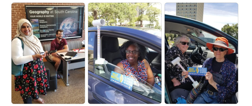
The map results from a project Dow undertook this summer in partnership with the City of Columbia, Richland County, the National Oceanic and Atmospheric Administration, the consulting firm CAPA Strategies and several other local partners. On August 6, nearly 40 volunteers drove on 16 routes throughout the region to collect temperature and humidity data with devices mounted on their passenger-side windows. CAPA Strategies processed the data to create the map.
Surprising heat
Even for a city known for being “famously hot,” the map of Columbia’s heat held some surprises.
“While the maximum temperature at the airport was 93 degrees, there were large areas of the city with temperatures over 100,” Dow says. Those hot areas, known as urban heat islands, trap heat due to prevalence of buildings, parking lots and equipment that may generate heat.
The difference is more stark when comparing the hottest and coolest parts of the city. When volunteers drove their routes at 6 a.m., the hot spots were already 9 degrees warmer than the coolest areas. In the afternoon, the temperature spread was 18.5 degrees, which Dow says is more than she had expected.
Understanding these differences is about more than just satisfying curiosity. Heat poses serious health risks, especially for children, elderly individuals, people who work outdoors, and those without access to air conditioned housing. The risk rises for people in a neighborhood where temperatures exceed official, recorded temperatures.
“Heat is the number one killer among weather hazards,” Dow says. “We hear a lot about hurricanes, lightning and tornadoes, but year in and year out, heat is the weather issue with the biggest public health impact.”
Trees could be the answer
The temperature contrast is especially obvious when you look at the shopping district in Harbison, Dow says. The paved-over district shows up beet-red on the map. Not far away, the Harbison State Forest is a cool sky-blue.
But you don’t need an entire forest to keep the heat at bay, based on Dow’s review of the map.
“Relatively small areas that have tree cover can provide a nice buffer between residential areas and the hotter commercial areas,” Dow says. “That experience you've had walking down the street, feeling the sun, thinking, ‘Wow, it’d be nice to have some trees on Taylor Street’ — those experiences are validated by this data.”
City and county planners will use the heat map to identify areas that need more trees or other interventions. Because the Biden administration has set aside funding for initiatives to mitigate heat risks, the heat map data could help local governments seek funding for projects that would make a difference.
“We’ve taken important first steps to be prepared to make smart investments about climate resilience,” Dow says. “We have to plan, because we already have areas that are uncomfortably hot, sometimes dangerously hot, and we expect to see more of those.”