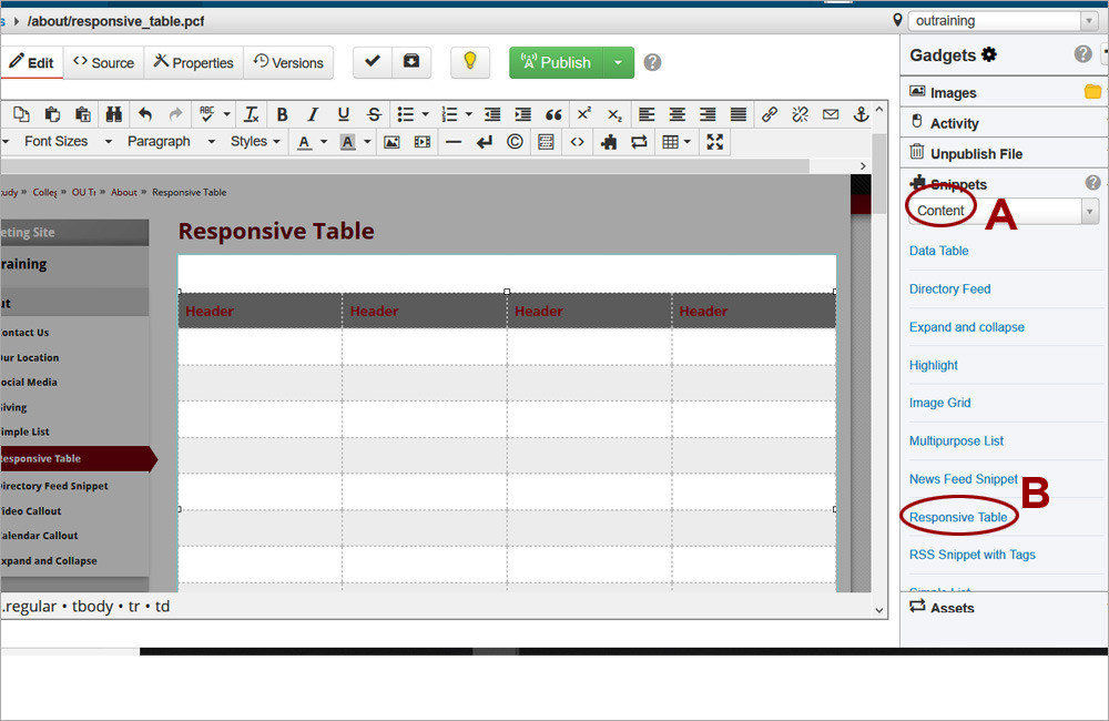
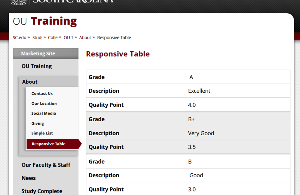
Skip to Content

CMS Training

Responsive Table

Tables can include up to five columns and any number of rows. The built-in style will render tables with alternating backgrounds on each row. On a mobile device the table restructures to display the headers as labels for each row. 

Pro Tip

Responsive Table

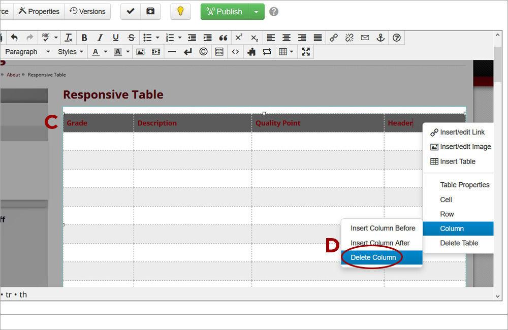
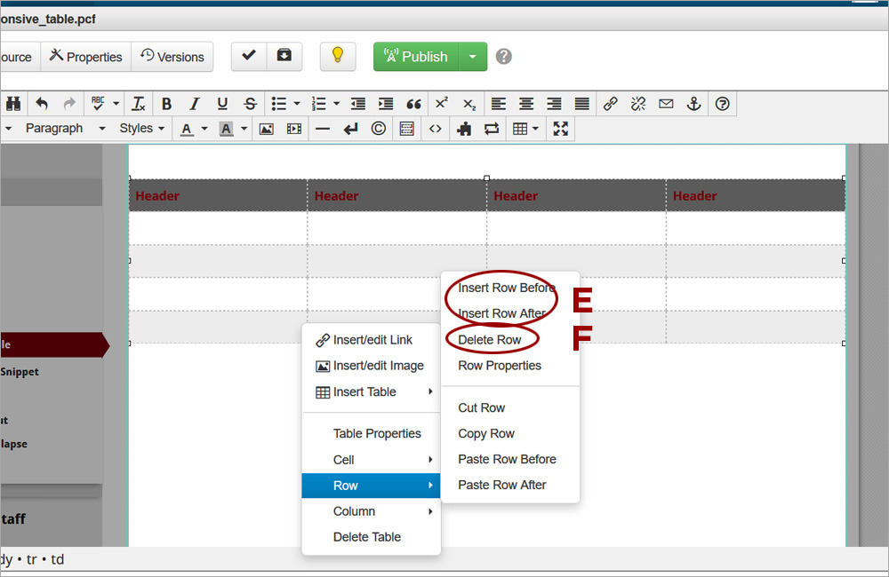
Tables should be created with the Responsive Table snippet in order to be mobile-friendly. Do not provide width or height in table properties or they will no longer respond correctly on different sreen sizes. For complicated tables using merged cells, tables can be built with the Table tool of the JustEdit toolbar. 

Watch the Video (10:01) and review the accompanying instructions.

  • Responsive Table1

    1. Access the Main editable region. Click the Gadget icon and open the Snippets gadget. Select the Content option (A) from the drop-down. Double-click on Responsive Table (B) to insert it.

  • Responsive Table2

    2. Update the table headers (C). To delete any table columns that are not needed, place the cursor in the column and right-click. Select Column->Delete Column (D).

  • Responsive Table 3

    3. To add additional rows to the snippet, place the cursor in the snippet table, right-click, and select Row->Insert Row Before/After (E). Alternatively, to remove unused rows from the snippet, place the cursor in the snippet table, right-click, and select Row->Delete Row (F).

  • Responsive Table 6

    4. Save the changes and preview the table. Shrink the browser screen size to simulate mobile view. The table will resize and show the headers for each row.

CMS Training


    Challenge the conventional. Create the exceptional. No Limits.

    ©