When is the last time you accidentally pulled a door that you should have pushed to open? I remember mine: My mind was racing about other things, like what to eat for lunch and about that meeting starting in five minutes. It was a glass door with an ambiguous metal handle on it. Subconsciously, that handle was my signal to pull.
I'll admit, I was frustrated when I realized that no matter how hard I pulled, the darn door would never open.
Don Norman calls this bad door design a Norman Door. It wasn't my fault that my instinct was to pull the door instead of push; it's up to the designer to devise a door that people will understand how to use. In his book The Design of Everyday Things, Norman breaks down design into seven fundamental principles to improve usability.
To take this one step further, a designer (or any content creator) should think about how people with disabilities interact with the physical and digital world in diverse ways.

An accessible door should not only be intuitive to use, but it should also have a "push to open" button, be wide enough for somebody in a wheelchair to enter and be reachable via a ramp or flat surface.
On the web, a hyperlink is kind of like the example of a physical door. It has the ability to transport you to another page, within the current page, or to download a document. Links are so common that just about any web page you land on will contain at least one link, as just about any room contains at least one door. You could say a link is a door to more content.
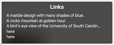
Unfortunately, not all links are so easy to use or desirable to click on. I'm weary of links sent from external email addresses or links that say, "Click here". Why should I click here? What is the context for this link? Vague link text is even more of an issue for somebody using a screen reader. Many screen readers allow people to navigate a page by a list of links, and vague link text like “here" does not provide enough context for the purpose of the link to be clear.
As Don Norman breaks down design into seven fundamental principles, the Web Content Accessibility Guidelines (WCAG) break down accessibility into four major principles:
These principles provide us with an outline for how we can think about creating links on the web that have a clear purpose and are easy to navigate for people with disabilities. The following advice is for the web accessibility of links, but many of the points apply to links in documents, emails, and other digital content.
Perceivable
- For somebody who is blind or low vision to perceive a link with a screen reader, use
appropriate semantics to markup links.
- In HTML, use the <a> element so that screen readers will recognize that the element is a link.
- If an image is used as a link, the image should have alt text that conveys the purpose of the link.
- Link text should be visible and distinguishable. Use a different color than surrounding text and underline your links so that they stand out.
Operable
- As interactive elements, links should be keyboard accessible. Can you tab to the link and press Enter to follow the link?
- Make sure you have a focus indicator for your link on hover and on keyboard focus. A visible focus indicator makes it possible for a sighted keyboard user with a physical disability to follow the focus as they tab through a page.
- A link with keyboard focus should be at least partially visible; in other words, a focused link should not be completely obscured by other page content.
- This piece of advice is based on WCAG 2.2, which was just released as the W3C recommendation on October 5. It is not expected that you adopt WCAG 2.2 immediately; however, it’s worth familiarizing yourself with the new success criteria which provide additional benefits for people with disabilities.
- A person who uses speech recognition software should be able to navigate to a link by its accessible name. The accessible name should match the link’s display text for this operation to work.
Understandable
- The purpose of a link should make sense out of page context. Since screen readers allow a user to extract a list of links, the link text should make sense on its own to be understandable.
- Use readable display text instead of the URL in the link text. It can be frustrating for screen reader users
to listen to long URLs, whereas concise link text is much more user friendly.
- For example, check out our guide on link text to learn more about how to write clear, understandable links.
- If display text is not an available feature, create a short link using a service like TinyURL.
Robust
- Links should function across different browsers, devices, and with assistive technologies like NVDA or VoiceOver.
Let it All "POUR" Out
It's easy to take links for granted as such a simple "everyday thing", but in practice, an inaccessible link can create a barrier like an inaccessible door can. The WCAG principles give us a helpful framework for thinking about different ways of accessing and using links. The next time you're including a link in your email, document, or website, ask yourself if the link is Perceivable, Operable, Understandable, and Robust (POUR). Soon it'll become second nature—accessible links will be “POUR”ing from you.