Making Charts and Diagrams Accessible as Images
Screen readers can't inherently understand what information you are communicating in your complex images without alt text. If you're sharing your chart or diagram as an on-screen image, you should include a two-part text alternative for it.
- Short description: briefly identifies the image in the alt text field.
- Long description: contains the "essential information conveyed by the image", often presented as a data table or nearby text.
Writing the Short Description
You can add a short description to your standard alt text field to identify the image and describe its most basic properties.
Take a pie chart, for example. In your short description, you should call out that the chart type is a pie chart and name what type of data it is displaying. You can save the detailed data points for the long description.
Writing the Long Description
Depending on what your image displays, your long description may be best communicated as a data table or a detailed text description.
- Data Table
For data visualizations and other charts that present trends in data, data tables are a screen reader accessible format for communicating your data. You can either provide an on-screen data table or provide a link to an accessible spreadsheet that contains the data. - Detailed Text Description
If your diagram's information is better described in a text format than a data table, you can either provide an on-screen text description with all the important details from your diagram, or you can provide a link to the long text description.
Example of Describing a Diagram
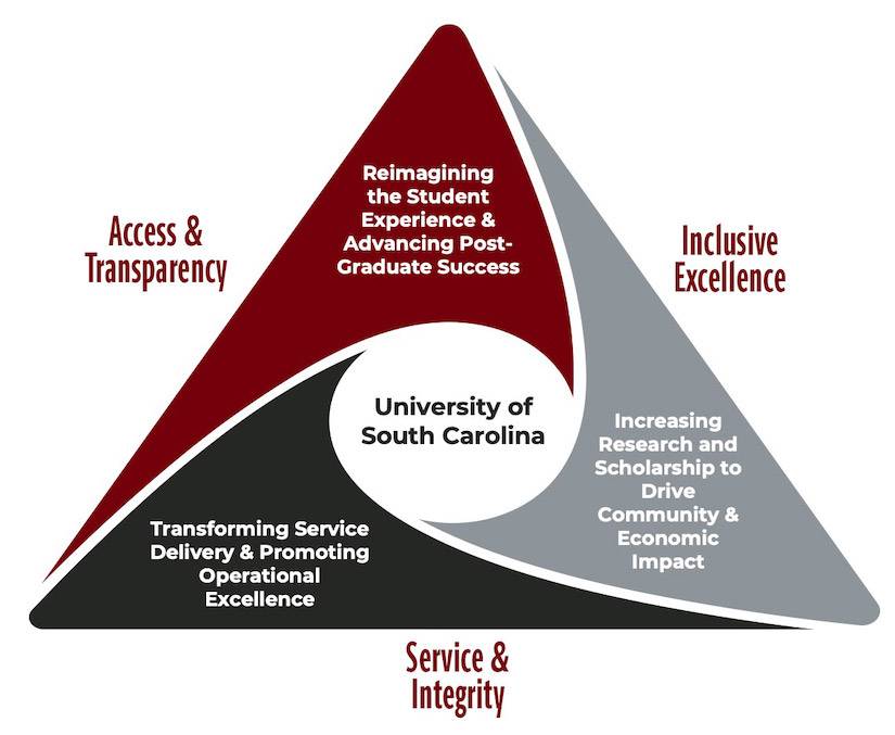
Short Description: A diagram of the Strategic Priorities for University of South Carolina.
Long Description: A triangle diagram with three sections, each labeled and coming together to the center that has the words University of South Carolina. The first section has the words Access and Transparency: reimagining the student experience and advancing post-graduate success. The second section has the words Inclusive Excellence: increasing research and scholarship to drive community and economic impact. The third section has the words Service and Integrity: transforming service delivery and promoting operational excellence.
Example of Describing a Chart
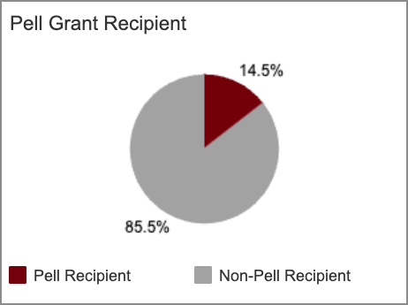
Alt Text: A pie chart of pell grant recipients with two slices.
Data Table:
| Pell Grant Status | Percent of Total Enrollment | Enrollment Headcount |
|---|---|---|
| Pell Recipient | 14.5% | 5,162 |
| Non-Pell Recipient | 85.5% | 30,428 |