Structuring your headings can help all users understand and navigate your digital
content more easily, including those with disabilities.
Organizing Headings
Headings help to break up text content into readable chunks. You can use heading levels
1 (<h1>) through 6 (<h6>) to establish a clear hierarchy of information. Nest headings
in order, being careful not to skip heading levels, to make your content as understandable
as possible for assistive technology users.
Start with heading 1.
Heading 1 is the most important heading on your page and should generally match the
page title. It is a best practice to only use one heading 1 per page. Within your
heading 1, you can nest multiple heading 2s and continue to sequentially build your
heading hierarchy.
Be careful not to skip heading levels.
For instance, do not skip directly from a heading 3 to a heading 5 without a heading
4 nested between them. You can, however, jump back to a heading 3 from a heading 5.
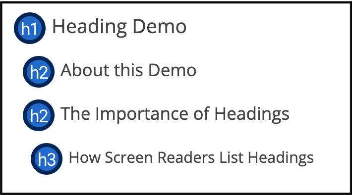
Example of organizing headings by hierarchy:
Writing Headings
Headings should be descriptive and straightforward, communicating exactly what information
someone will find if they engage with the content beneath that heading. Your goal
should be to write headings that are so clear that someone could skim just your headings
and understand the gist of the entire page.
Clear Heading Example: "Reasons Why Digital Accessibility is Key" This heading lets us know exactly what will be discussed within its content.
Unclear Heading Example: "Information About Digital Accessibility" This heading is too vague to clearly communicate what information will follow.
The Semantics of Headings
Headings are for indicating the structure of your content, not for making your text
look big or bold. Screen readers allow users with visual or cognitive disabilities
to navigate a page by heading levels. It is important that headings are marked up
using the styles built into your tool or program so that heading navigation works
as expected.
If you simply need to make part of your content stand out, try using:
Bold Text
Lists
Special Styling (if you have control of the content's design)
Be careful not to use empty headings for extra white space on your page. If you add a new line before a heading in a document or content management system,
it may also be formatted as a heading but appear empty. A blank heading looks like
a gap in your site structure to screen reader users.
Adding Headings in Specific Platforms
The way you'll add headings to your document or web page will depend on the platform
you're using to publish digital content.
Pro Tip: In Microsoft Word, use the Accessibility Checker automated tool to verify that your document contains headings, and use the Navigation Pane to browse your document by any heading styles you've applied.
OCR Video Series: Heading Structure
Learn more about how to use proper heading structure in this topic from the OCR video
series.
Challenge the conventional. Create the exceptional. No Limits.